To rank your app high on the Google Play Store, your app’s ratings and reviews and App Store Optimization (ASO) do the heavy lifting.
But once users are on your app listing, a few other elements come into play – one of them being app screenshots. Alongside app preview videos, it’s screenshots that help users decide whether to download your app or not.
Studies reveal that, on average, a Google Play visitor only spends 14 seconds on an app’s product page and is likely to read only 10% of the content.
This makes screenshots all the more important, as they’re the first thing your target audience sees.
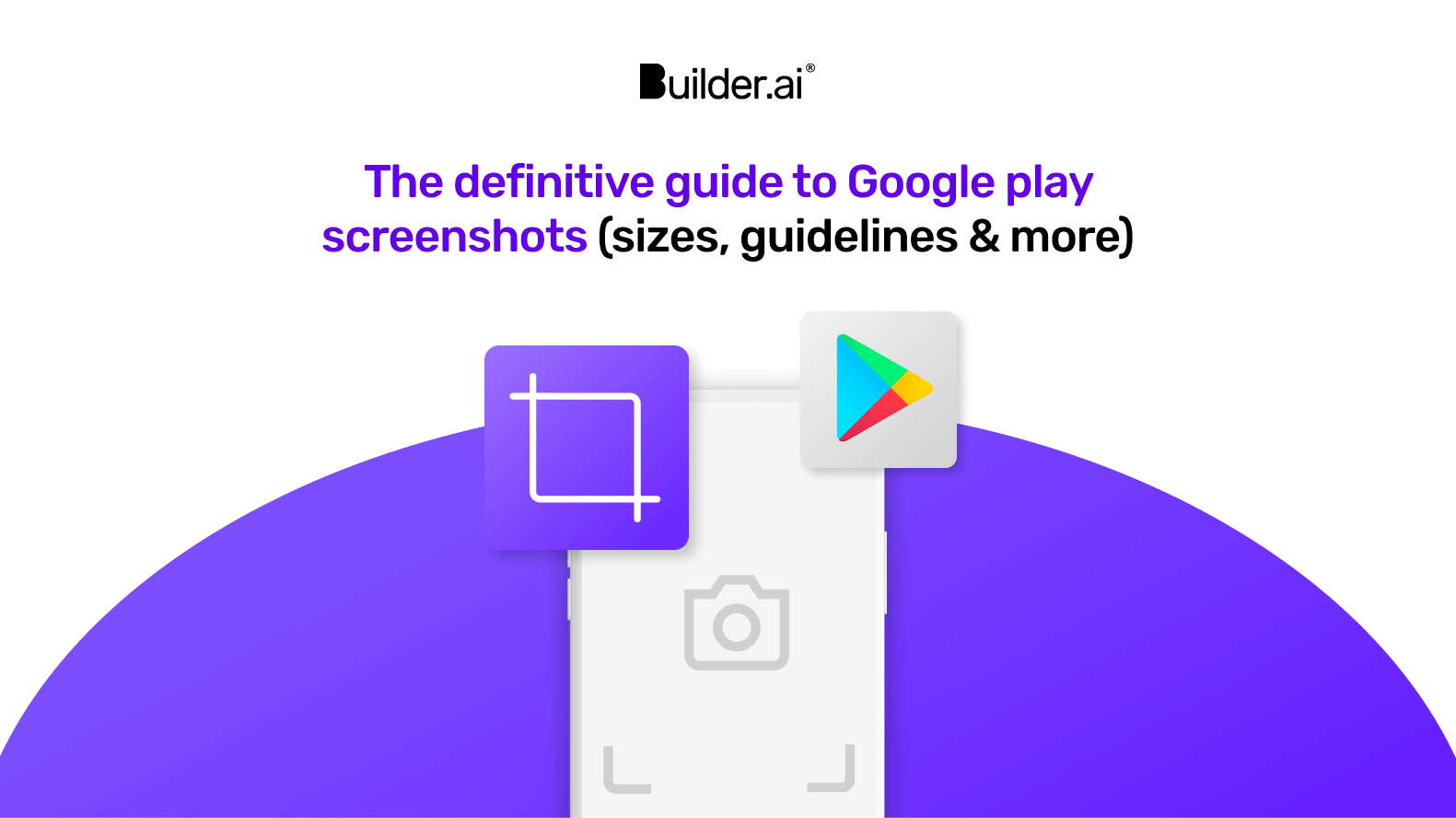
In this guide, we’ll walk you through Google Play’s screenshot guidelines and provide you with tips and tricks for creating screenshots that encourage users to hit that Installbutton.
Let’s get started. 👇
Google Play screenshot sizes & guidelines
For uploading screenshots, Google Play guidelines are more flexible than the Apple App Store screenshot guidelines. Unlike Apple App Store, Google Play Store has fewer rules and restrictions, making it easier for you to showcase your app.
On Google Play, you must provide at least 2 screenshots but can add up to 8. These screenshots are visible across various devices, including smartphones, tablets, Android TVs and Wear OS by Google.
You're not required to fill all 8 slots but using all 8 can really help showcase your app’s features and deliver your message.
To help you upload screenshots, Google provides 2 types of guidelines:
1 - Required guidelines — these are mandatory
2 - Highly recommended guidelines — these aren't mandatory
We’ll dive deeper into both of them now 👇
Google Play Store screenshot “Required” guidelines
Required guidelines are the set of guidelines you must follow to get your app live. Failure to meet these requirements may result in your app being removed or suspended from Google Play.
To publish your store listing, you must provide a minimum of 2 screenshots across form factors that meet the following requirements:
- JPEG or 24-bit PNG (no alpha)
- Maximum size of screenshot: 8mb
- Screenshot minimum dimension: 320px
- Screenshot maximum dimension: 3840px
- The maximum dimension of your screenshot can't be more than 2X the minimum dimension. For example, if the maximum dimension is 2000 px, then the minimum needs to be 1000 px.
Chromebooks and tablets
- For Chromebooks and tablets, you must add a minimum of 4 screenshots to demonstrate your in-app experience
- Upload images between 1,080 and 7,680px
- Use a 16:9 aspect ratio for landscape and a 9:16 aspect ratio for portrait
- Exclude additional text that isn't part of your core app experience, as this can get cut off on Play homepages on certain screen sizes
Wear OS
If your app is for Wear OS devices, your store listing page on Google Play must:
- Contain at least 1 screenshot that accurately depicts the current version of the app on Wear OS
- Provide screenshots showing only the app interface
- Not position the app screenshots within device frames or include additional text, graphics or backgrounds that aren't part of the interface of the app
- Include app screenshots with a 1:1 aspect ratio and with a minimum size of 384px by 384px
- If your app offers Tiles, then it’s recommended to share a screenshot of the Tile functionality
- Don’t include transparent backgrounds or masking
Android TV
If you’re distributing an app to Android TV devices, then:
- You need to add at least 1 Android TV screenshot before you can publish your app
- JPEG or PNG format (no alpha)
- TV screenshots size: 1280px by 720px size dimension
Google Play Store screenshot “Highly recommended” guidelines
Google also provides “highly recommended” guidelines. Following these gives an app a viability boost because Google wants Play Store apps to have high-quality listings.
Failure to comply with highly recommended guidelines won't prevent your app being seen or promoted. But following them makes your app likely to be recommended and promoted throughout Google Play, thereby increasing your app downloads.
Apps
For apps, you must provide at least 4 screenshots with a minimum 1080px resolution. These should be 16:9 for landscape (minimum 1920px by 1080px) screenshots and 9:16 for portrait screenshots (minimum 1080px by 1920px).
Games
For games, you must provide at least 3 16:9 landscape screenshots (minimum 1920px by 1080px) or 3 9:16 portrait screenshots (minimum 1080px by 1920px). Make sure that these screenshots depict the in-game experience so users can get a sense of what the gameplay will be like if they download and play.
Generic recommendations
Google also provides you with more generic recommendations to improve your store listing 👇
- Prioritise UI in the first 3 screenshots as much as possible
- Demonstrate the actual in-app or in-game experience
- Use captured footage of the app or game itself. Don't include people interacting with the device, such as fingers tapping on the device
- Add taglines only if necessary to convey the key characteristics of the app or game; these shouldn’t take up more than 20% of the image.
- Avoid adding any form of call-to-action, for example, "Download now," "Install now," "Play now," or "Try now"
- Avoid time-sensitive taglines or content that can become outdated quickly to reduce the need to update
- Localise your graphic and branding text as appropriate for different markets and languages
- Don't include screenshots that are blurry, distorted or pixelated in a way that isn't an intentional aspect of your brand
- Avoid inappropriate image elements, such as third-party trademarked characters or logos without proper permission
- Include alt text with each screenshot
Google Play Store aspect ratio and layout requirements
When creating app screenshots, you need to decide whether portrait or landscape screenshots showcase your app better.
Thankfully, this is pretty easy! For standard apps, stick to portrait orientation.
This is because portrait screenshots are much easier to scan and a user can see two screenshots at a time. Also, your app is most likely designed for portrait orientation, so it makes sense to use portrait orientation screenshots too.
However, if your app is going to be used in landscape orientation, like in gaming apps, then it’s better to create horizontal screenshots. The idea is to showcase your app's UI through your screenshots. This is also true for Android TV apps, as televisions are landscape oriented.
When it comes to aspect ratio, it's worth noting that all screenshots you upload to the Google Play Store must adhere strictly to a 16:9 aspect ratio for landscape and a 9:16 ratio for portrait. This aspect ratio guarantees the proper and optimal display of your screenshots on a diverse range of devices and screen sizes.
Google Play Store Screenshot colours and backgrounds
Choosing the right colours and backgrounds for your Google Play Store screenshots mostly comes down to your app design.
Bear in mind how colours can define the moods and behaviours of your target users. For instance, if you have a finance app, then keep it minimalistic and stick to a sober colour for the background. Whereas for a food ordering app, you can be more adventurous.
No matter what your app is, here are some guidelines that’ll help you create screenshots that are visually appealing 👇
Use high-quality images
Use high-quality, pixel perfect screenshots. Use only high-resolution images that showcase your app's features and user interface in the best light.
Choose contrasting colours
Basic design rules apply! Pick colours that contrast or complement each other to make your screenshots stand out. Avoid using too many similar or clashing colours, as this can create a cluttered, confusing and unprofessional look.
Use a consistent colour scheme
Maintain a consistent colour scheme throughout your screenshots to create a cohesive and professional look. This will make your users recognise your app and easily associate it with your brand.
Avoid using too much text
For text, less is more. Be sparing with the words you use. Too much text makes screenshots appear cluttered and confuses the messaging. Instead, use concise captions to highlight key features that users can process at a glance.
Use a clean and simple background
Don’t use busy backgrounds. A simple background helps to draw attention to your app's content and makes it easier for users to focus on the features.
Test your screenshots on a different device
Don’t forget to test your screenshots on different devices and orientations to ensure they look great on all screen sizes and resolutions.
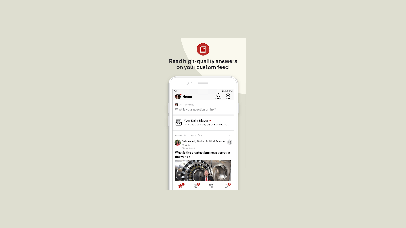
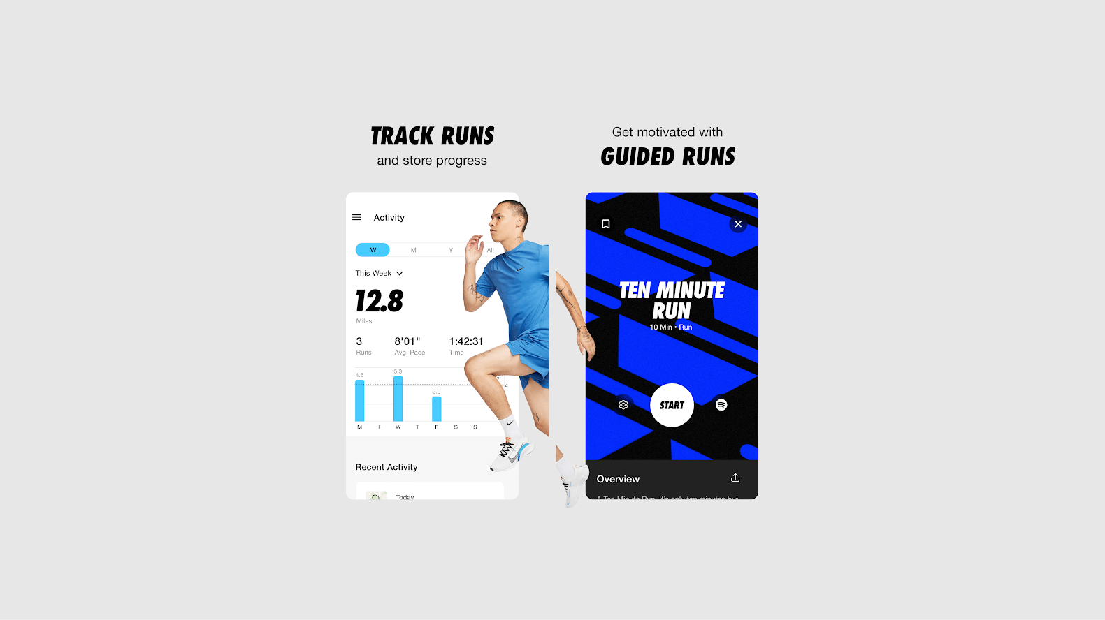
Styles of Google Play Store screenshots
Want to start your app project with us?
Book a demoSpeak with one of our product experts today.
By proceeding you agree to Builder.ai’s privacy policy and terms and conditions

Now there are many ways you can design your screenshots. Let’s take a look at some of the commonly used styles 👇
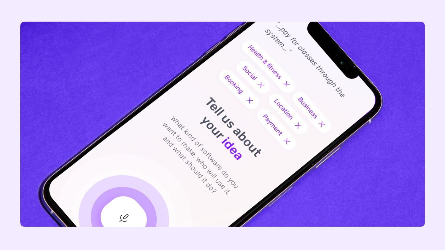
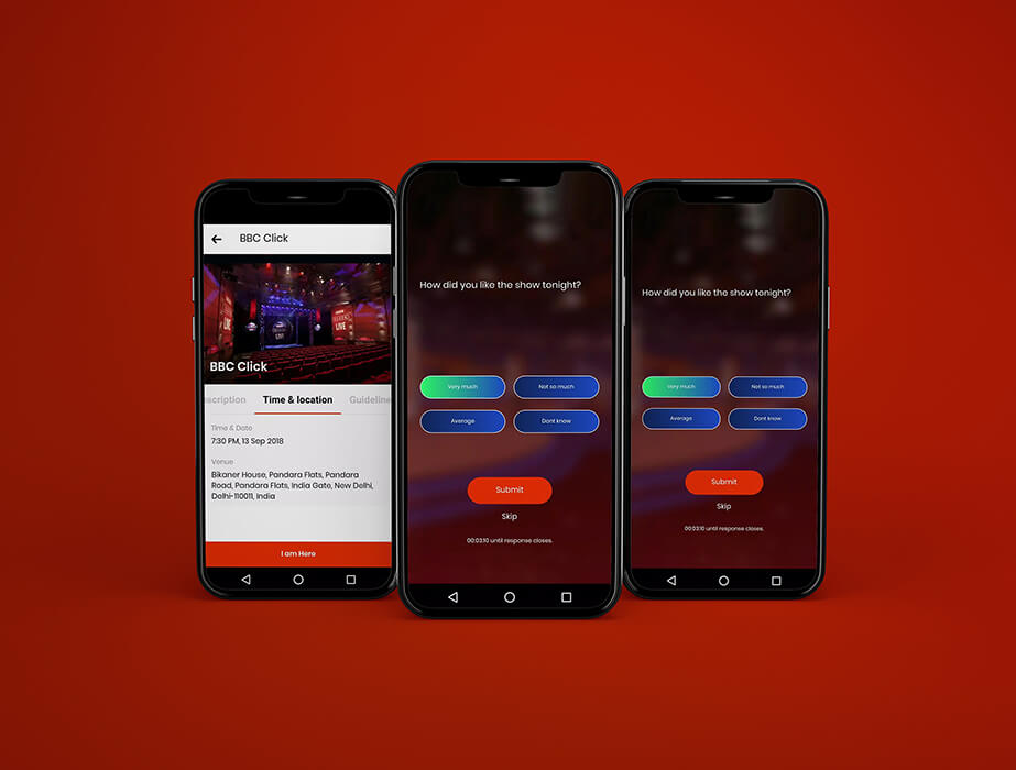
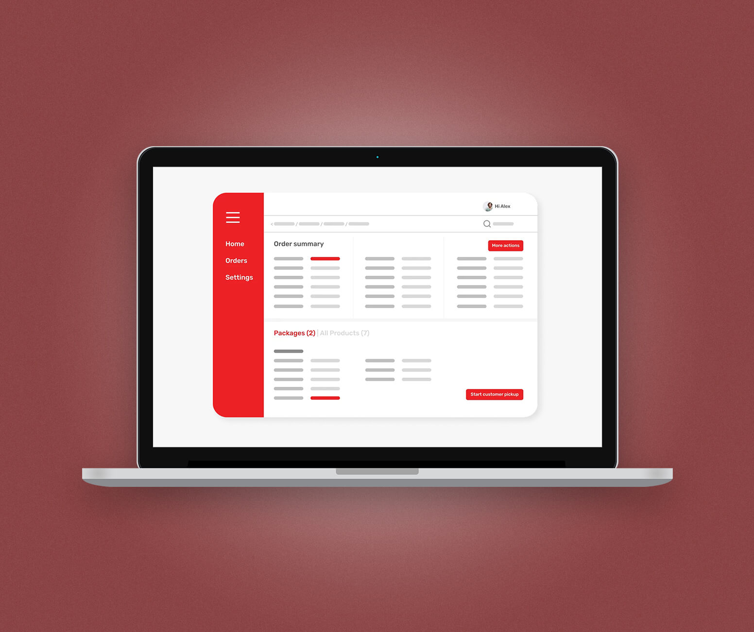
1 - Feature showcase
This style of screenshot showcases specific features and functionalities of your app. And this style is incredibly easy to make.
The downside is that this style of screenshot can be a bit less engaging. It doesn't communicate your messaging and it might not be clear to a user what’s being shown.
The simplicity makes them a great option if you have a tight deadline to get your app listing live. After that, you could update your main store listing with more sophisticated screenshots.
Pros
- Easy to create
- Shows all the core features
Cons
- Less engaging
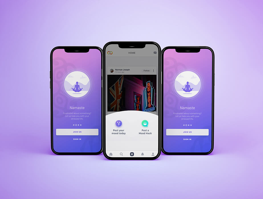
2 - Lifestyle screenshots
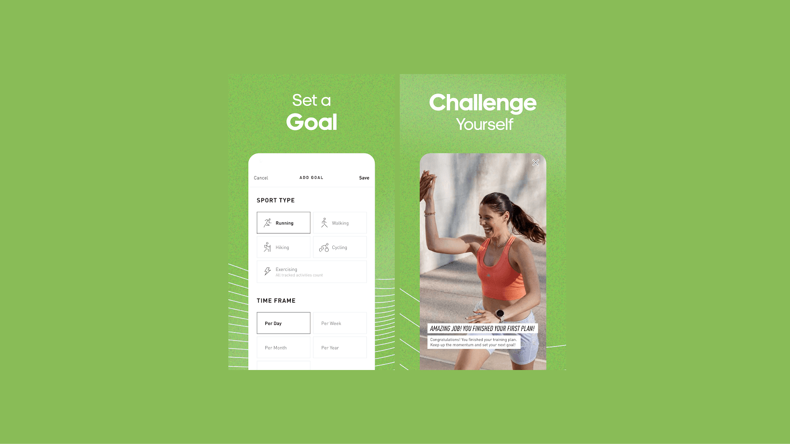
In this style, your screenshots show real-life situations your app might be used in.
For instance, if you have a fitness app, then you can show people exercising or track their progress.
This way, your users can visualise how your app solves their problems and how it'll fit into their lives.
Pros
- Demonstrates use cases
- Enhanced engagement
Cons
- Can be challenging to create
3 - Connected
You can also use multiple screenshots in a sequence to create the impression of one larger image.
This eye-catching technique can display a richer image, journey or workflow than a standalone screenshot. This style needs more skill to pull off, and failing to do so can leave a poor impression. They need careful planning and good designers to get right.
Pros
- Easier to showcase a workflow
- Visually appealing
Cons
- Requires careful planning
- Can be confusing
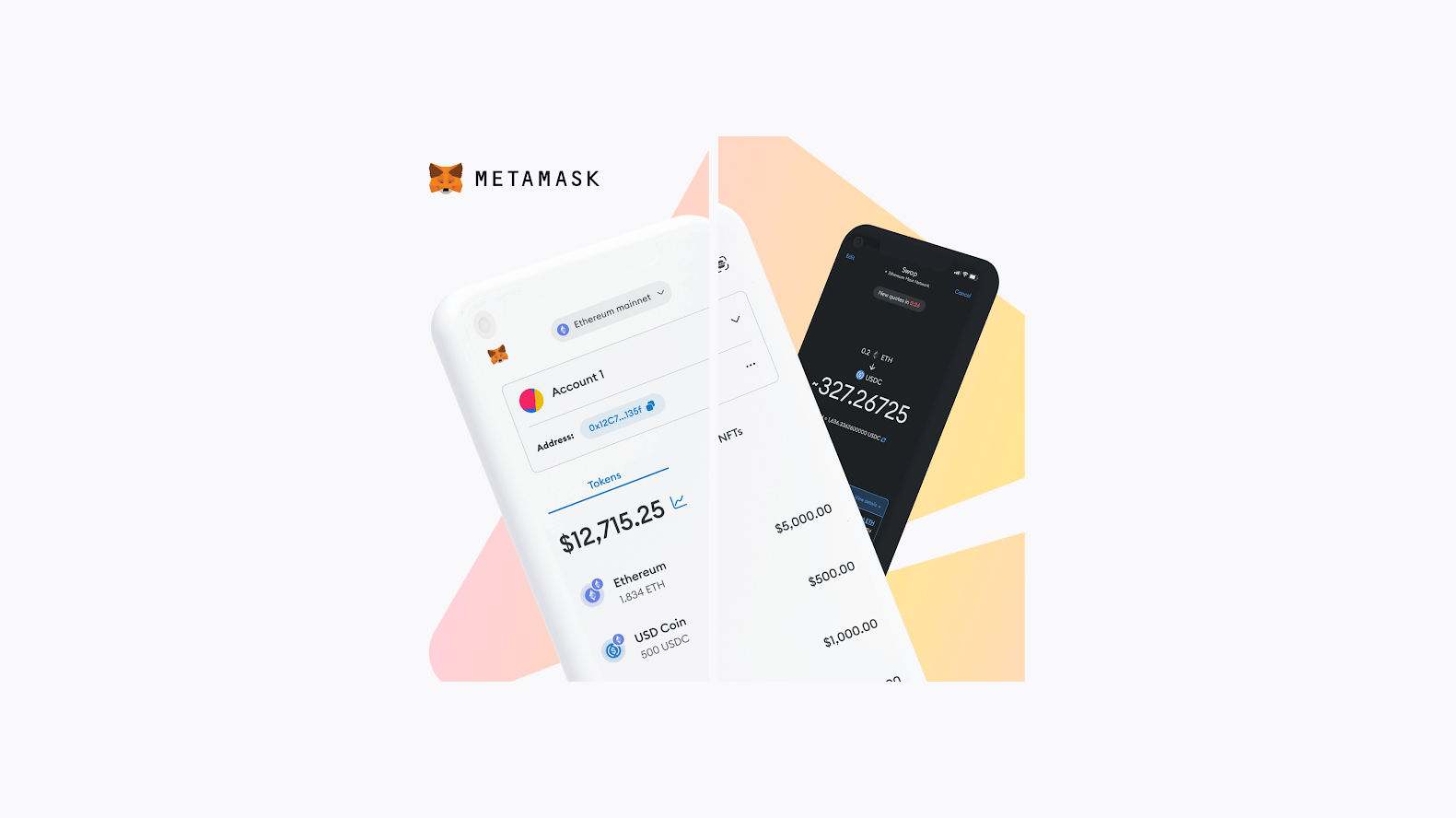
4 - Background and device
This style is similar to the feature showcase style but with a solid colour or a blurred background behind the device frame.
This style is used to overcome the downsides of the more basic feature screenshot. This way, you can add a touch of colour or a sense of depth to your screenshots while maintaining a clean look.
By using the background and device style, you create consistent and aesthetic screenshots.
Pros
- Easy to create
- Focus on app features and functionalities
Cons
- Not very engaging
5 - Hybrid
This style of screenshot combines design elements from multiple styles of screenshots. You can blend photography, screens, branding and messaging to create (arguably) the most engaging type of screenshot.
Pros
- Flexibility to incorporate any element
- Highly engaging
Cons
- Very complex to design
- Can show inconsistencies in the design
Google Play Store screenshot examples
Below, you can see how Builder.ai's clients use Google Play Store screenshot best practices in their own app store listings. Hopefully, this should help to inspire your own 👇
OpiGo
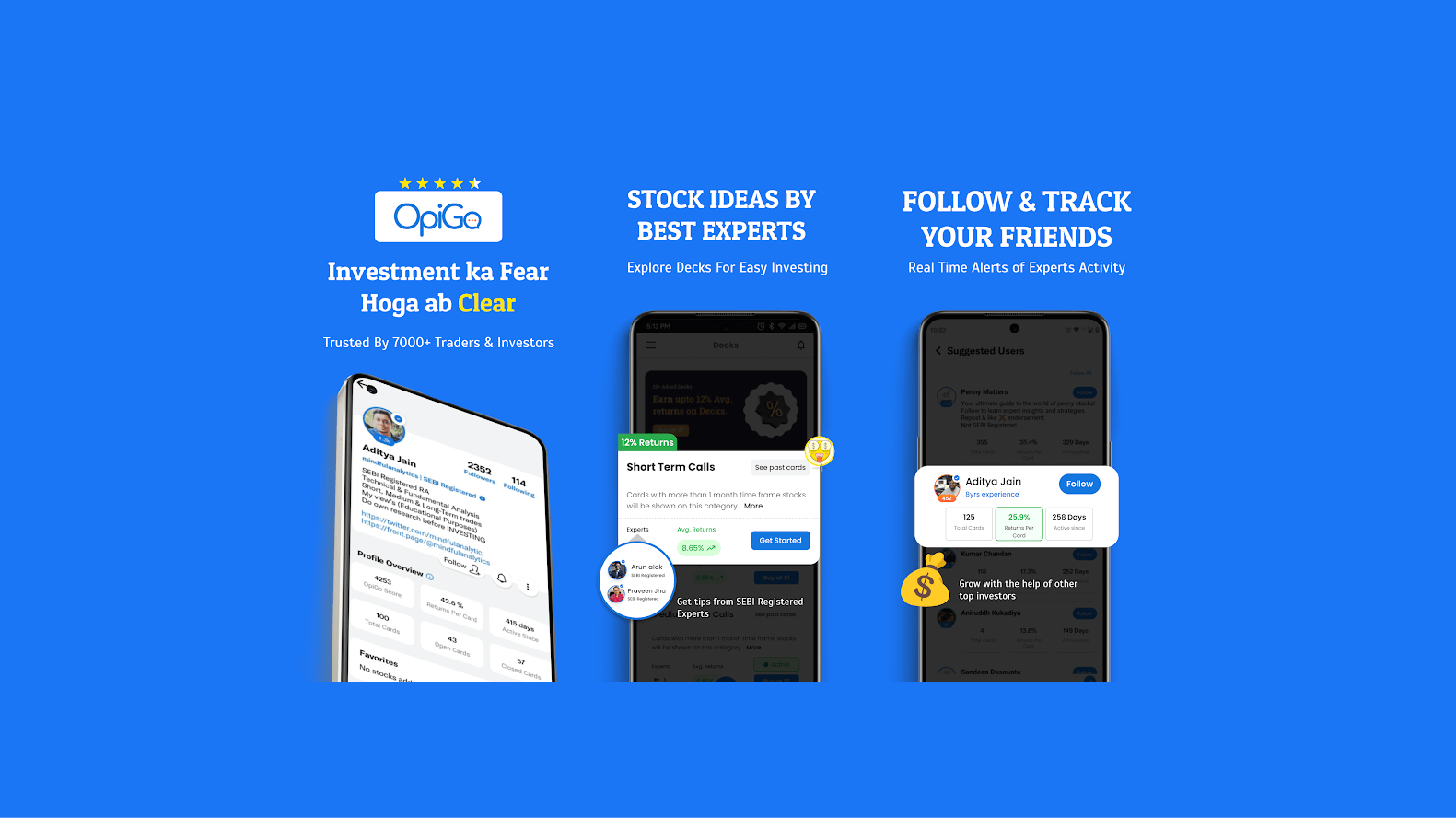
OpiGoOpiGo is India’s new-age social platform where users can experience a gamified way of sharing stock ideas with friends.
In the app, you can make stock buddies, interact with experts and learn to invest in the right way.
The screenshots of the OpiGo app follow the background and device style.
Lesser
Lesser is Saudi Arabia’s first recycling app. The platform makes it easy for individuals to play their part in a zero-waste future and creates an incentive for them to recycle through a gamified reward scheme.
The screenshots shown here follow the “background” and “device” style of screenshot.
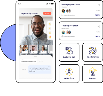
YLanes
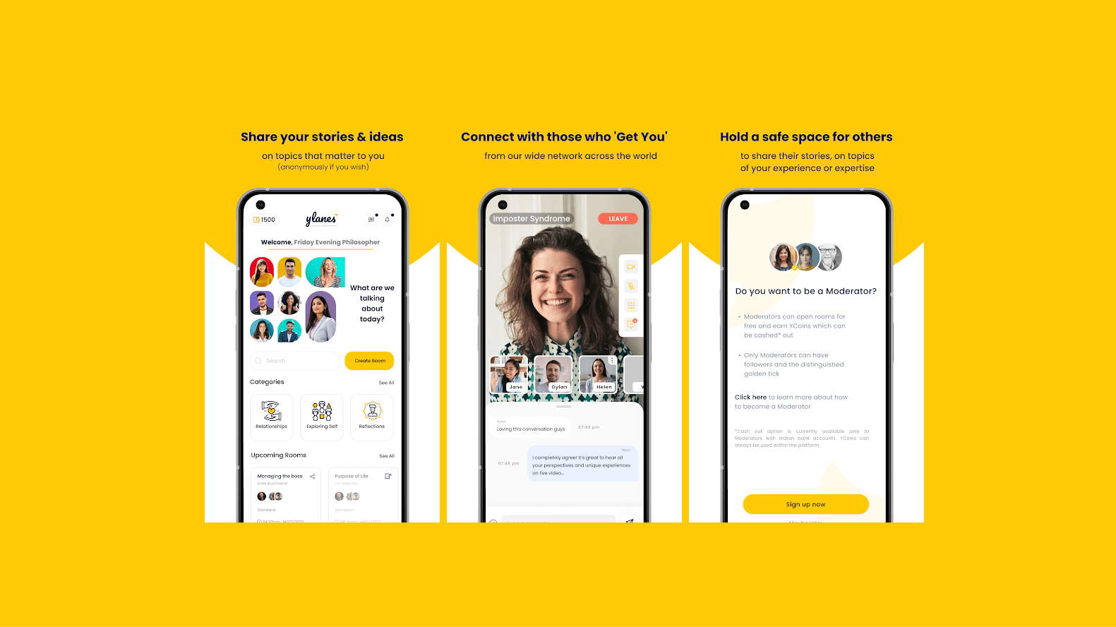
YLanes is a conversation app where you can be your true self and connect with those who ‘get you’. The platform serves as a safe, non-judgemental space, designed to enable meaningful conversations.
The screenshots of the YLanes app follow the hybrid style.
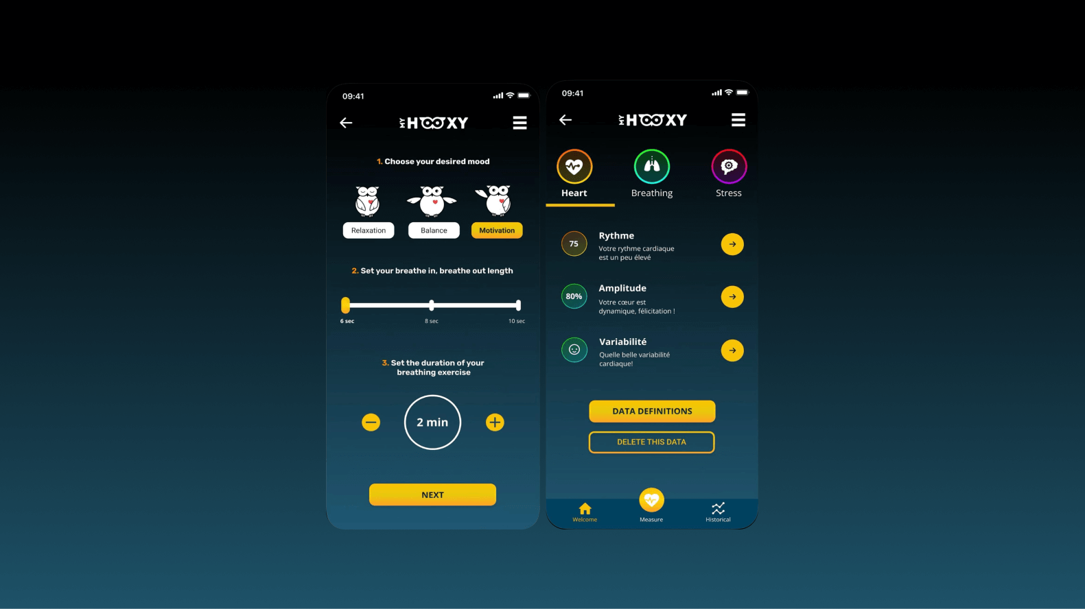
My Hooxy
My Hooxy is a smart oximeter solution that helps you take care of your wellbeing.
The app helps you measure your oxygen saturation and heart rate in real time. Also, the app helps you control and improve your abdominal breathing.
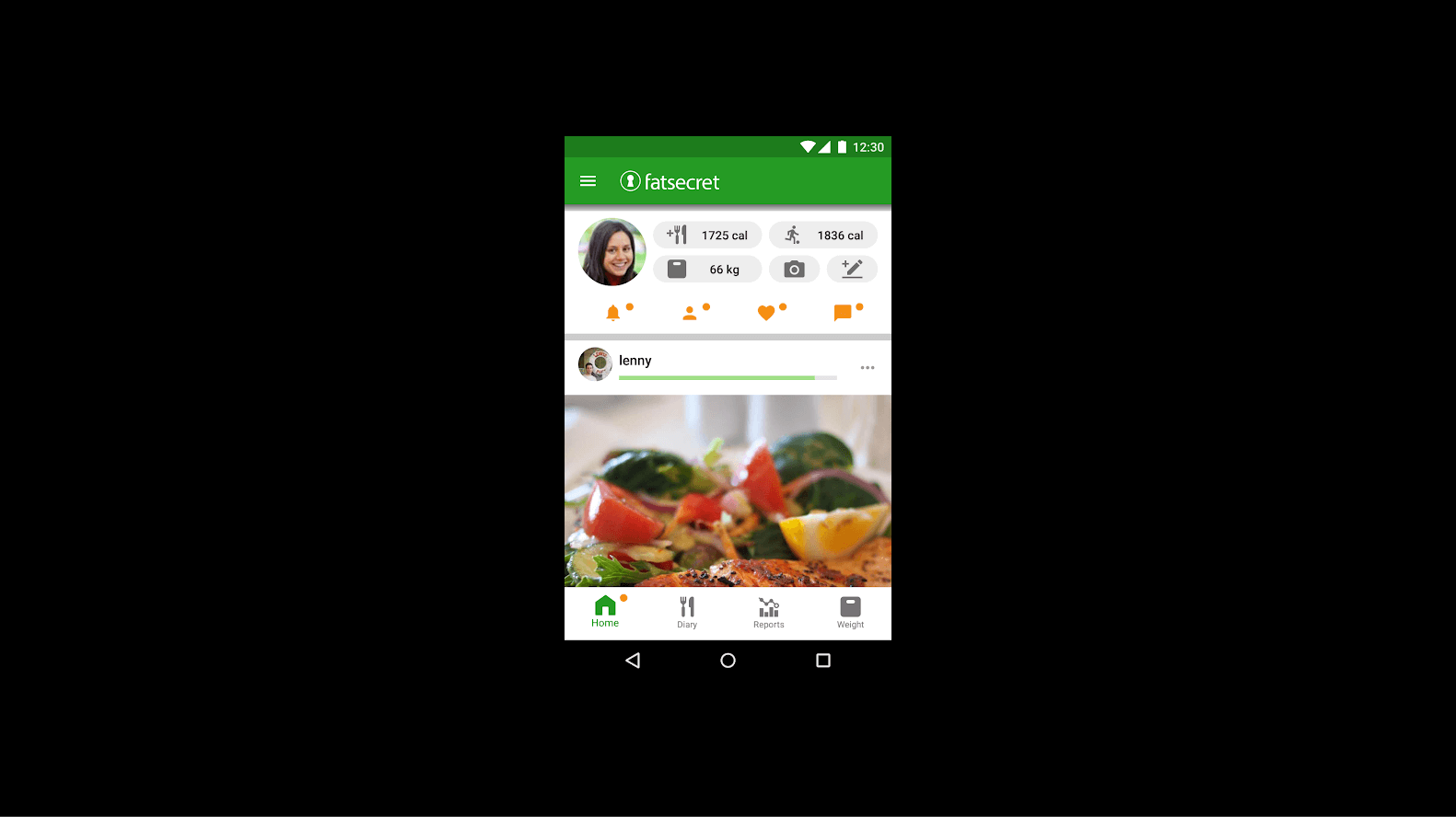
The screenshots of My Hooxy app follow the feature showcase style.
Google Play Store screenshot best practices and tips
To perfect your screenshots and enhance your app store optimisation efforts, follow these best practices 👇
1 - Show your USP in the first 2 screenshots
Whether it’s an innovative feature or an exceptional user experience, make sure you start your listing strong by communicating your USP in the first two screenshots. This is because the first two screenshots are always visible to users.
This is why you need to think ahead of time to make sure they’re effective in getting your message across.
2 - Provide context for your screenshots
Users should be able to understand what they're looking at in your screenshots. You can do this by providing context for your screenshots by including relevant text and images.
For example, imagine you're showing a screenshot of your app's home screen. Instead of leaving users guessing, include text that explains what they’re seeing. This way, your users know what to expect from your app.
3 - Use 4-7 words of text per screen
Yes, it’s important to provide context for your screenshots. But lengthy text in screenshots is the easiest way to clutter your screenshots and overwhelm your users.
The shorter the text, the more appealing your screenshots become.
In any case, don’t use more than 10 words per screenshot.
Instead, use small and punchy one-liners to highlight your USP. For instance, the YLanes app uses “Connect with those who ‘Get You’,” to highlight its USP.
4 - Make them fun
Add personality to your screenshots to make them fun and attractive. You can do this by throwing in some vibrant colours and playful graphics.
Making your screenshots look unique and fun is inviting to users, which gives your app one more reason to be downloaded.
5 - Tell a story
Use your screenshots to narrate a story. Create a narrative that progresses from one screenshot to the next.
This illustrates the journey users will experience in your app and, at the same time, demonstrates the value of your app along the way.
6 - Check out your competition
The easiest way to create great screenshots is by analysing what your competition is doing. Check out the screenshots of your competition to identify what works and what doesn’t in terms of design and messaging.
Use this information to make your own screenshots and find ways to make your app stand out from the competition.
Conclusion
Creating screenshots for the Google Play Store will definitely be one of the easier tasks in launching an app! Don’t worry about it too much.
However, if you want to create compelling screenshots that increase your conversion rates, you need a clear idea around look and visuals and user journeys.
Builder.ai helps you do this. When you build your app with us, our designer works with you to create your screenshots, calling out key messages and ensuring that they’re consistent with your brand.
Hit the banner below and create your app today 👇
Want to start your app project with us?
Book a demoSpeak with one of our product experts today.
By proceeding you agree to Builder.ai’s privacy policy and terms and conditions
Laura McAllister is a seasoned Productologist at Builder.ai, specializing as a Product Owner. Her expertise lies in spearheading the successful launch of multiple apps and websites for growing businesses and startups. With a keen eye for detail and a knack for translating client visions into reality, Laura consistently delivers innovative solutions that drive tangible results.


 Facebook
 X
X LinkedIn
 YouTube
 Instagram
 RSS
RSS